Sock curl
2024
In this project case study, I will be sharing my experience designing a travel booking website for a boutique travel agency. The aim was to create a website that made it simple for users to search for destinations, compare packages, and book their trips.
Throughout the design process, I concentrated on crafting an intuitive user interface that would enhance the overall user experience and drive user engagement with the website.

Hypothesizing
Understanding Traveller Preferences
The design process began with comprehensive user research to understand the diverse preferences of travellers. This involved conducting surveys and interviews to identify key factors influencing travel decisions and pain points with existing booking websites.
Creating a Custom Itinerary Planner
Based on the insights gathered, I focused on developing a customised itinerary planner. This feature allowed users to create personalised travel plans, compare different options, and adjust their itineraries according to their preferences.
Ensuring Seamless Navigation
A major focus was on ensuring seamless navigation throughout the website. I designed intuitive navigation paths and incorporated advanced search filters, making it easy for users to find relevant information and book their trips without any hassle.


Result
The final outcome of the travel booking website was a user-friendly and engaging digital product that exceeded the client’s expectations.
Users could easily search for destinations, compare travel packages, and book their trips, all within a seamless and intuitive website experience.
As a result, the travel agency saw an increase in user engagement and bookings, and the website has become a vital component of their overall customer experience.
More work

Location of items cannot be learned even by regulars
Items can be moved, seasonal, or out of stock
Lack of route planning affects experience
Can be tedious if lugging a heavy basket
Unavailable items adds time to the shopping process
Frustrating and time-consuming to find a substitute
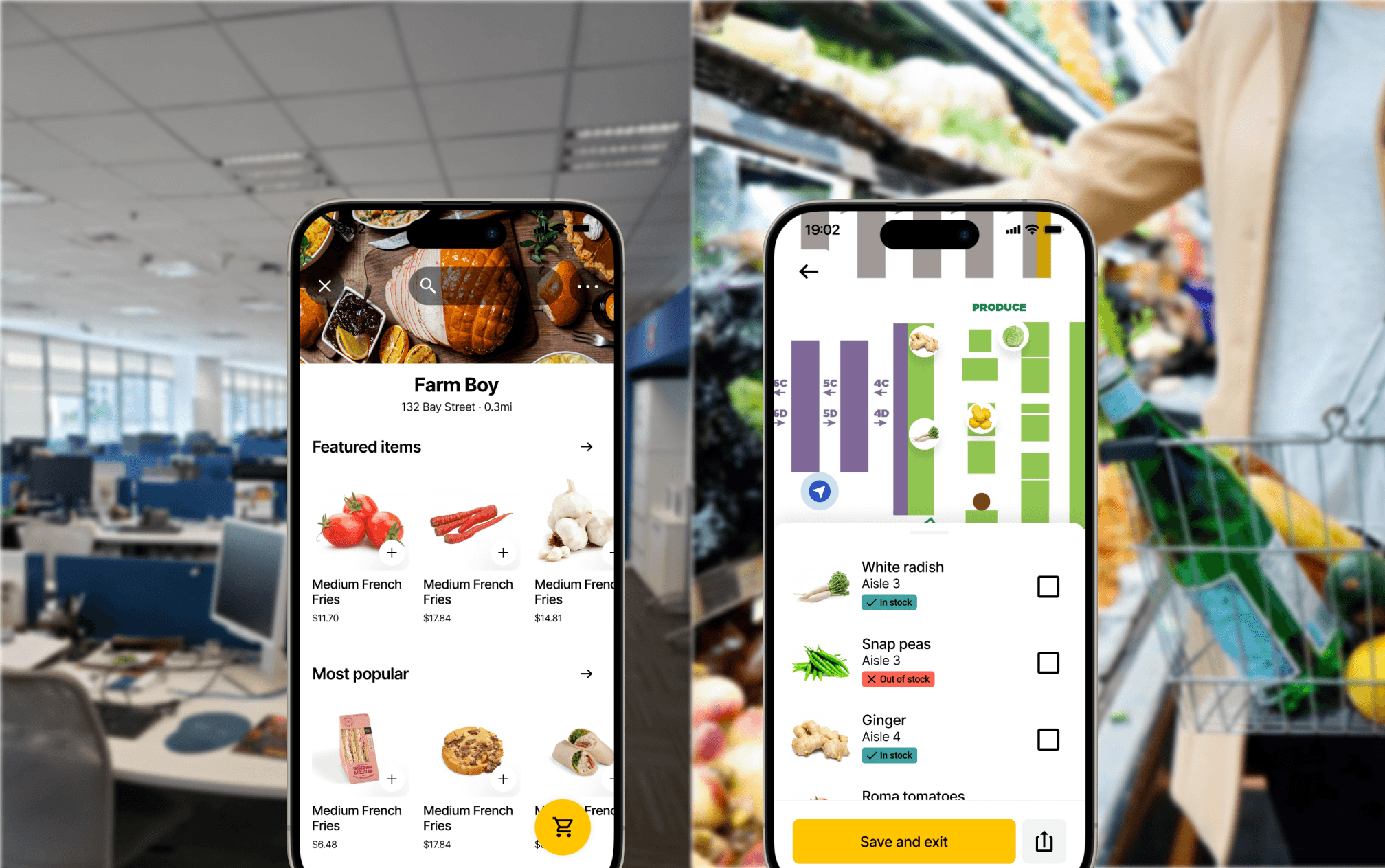
Arrive at the grocery store with a plan
Create a shopping list of things based on up-to-date stock information
Move through the store efficiently
Follow an optimized path to complete your shopping trip
Reflection
I found conducting user interviews in-context was particularly helpful as it brought insights into what features were absolutely necessary and which were nice-to-haves. For example, I originally wanted users to be able to add new grocery items from the shopping screen. Observing shoppers in-context showed me that they had little need for it.
Identifying necessary vs. nice-to-have features is especially important in future projects if timelines are tight. It can allow for faster iterations which produces a product better fit for the user in a limited time frame.
Kayla Ray
@kayray