Westcoast Totes
I led the redesign of the e-commerce experience and introduced a proprietary personalization feature - increasing online sales by 45%
Client
Westcoast Totes
Timeline
March - July 2024
My role
Lead designer
The team
2 designers, 1 engineer
Introduction
Westcoast Totes offers customers the unique experience of personalizing their own tote bag with a wide selection of patches. 98% of its sales are in-person at local markets, an Etsy store made up the remaining sales.
The founders of Westcoast Totes asked me and my design partner to design a website that helps their users personalize tote bags online.
Problem identification
Improving the online personalization experience can significantly increase sales and improve accessibility to products
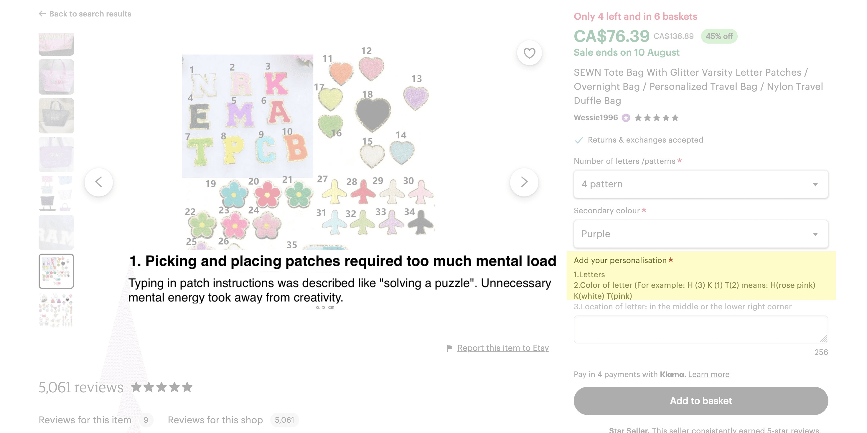
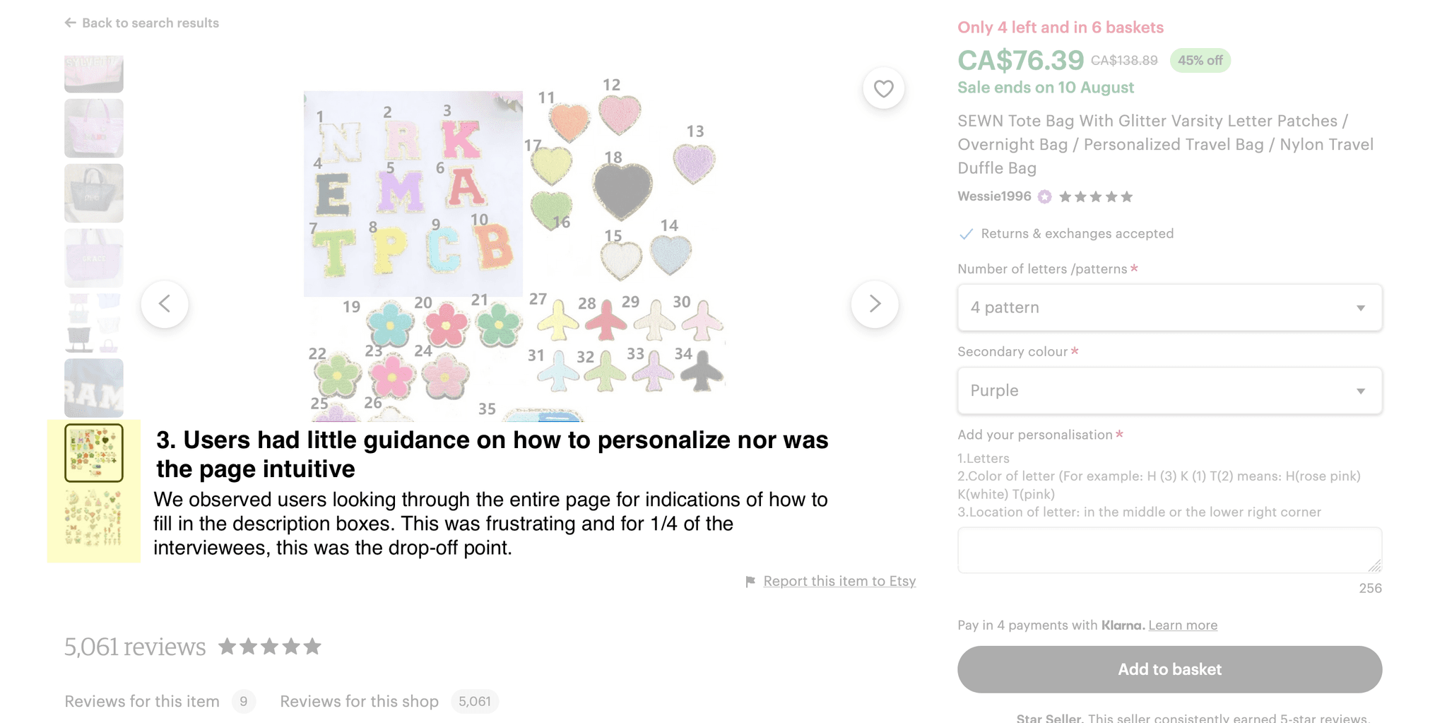
Through interviews with customers, we learned that the Etsy store experience was not intuitive and frustrating. Attempts at translating design ideas onto the product page was time-consuming and required more cognitive load than necessary.
Improving the online experience can mean increased sales and reduce the business’ dependency on attendance at pop-up markets.
Problem breakdown
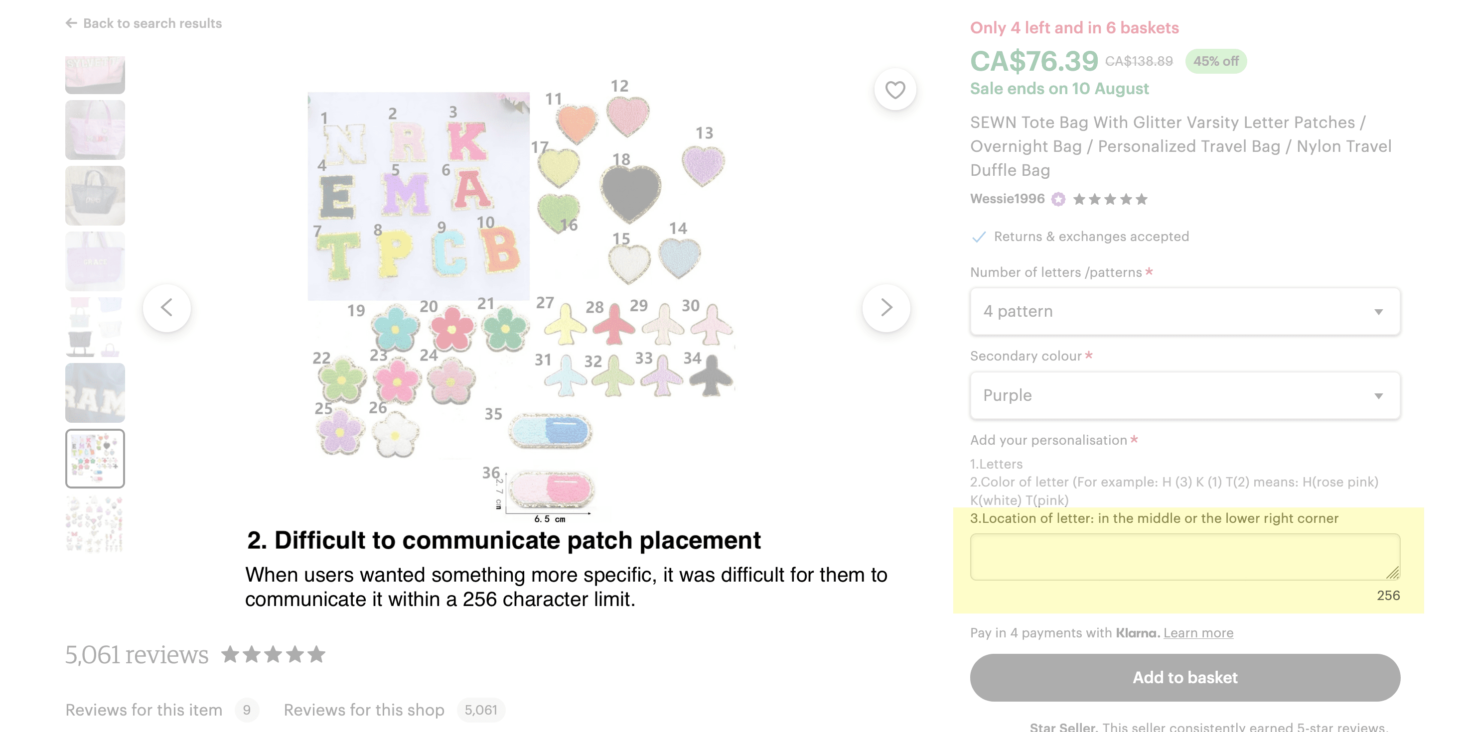
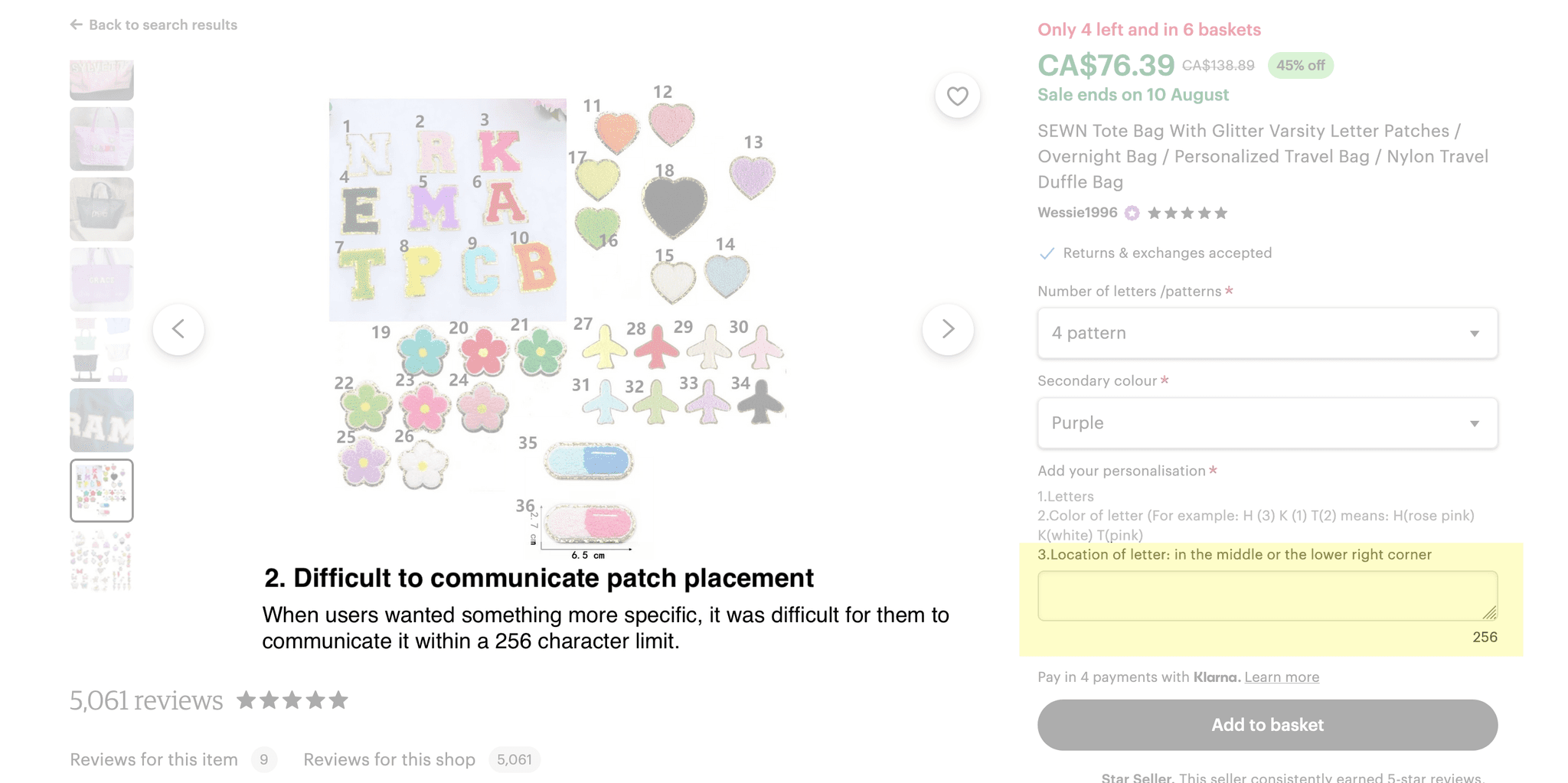
Almost all of the 6 interviewed customers pointed out the following issues with the current online platform
How might we
Deliver an intuitive personalization experience?
Research
What functionalities are necessary and what are ancillary?
6 users personalized a product on 2 different e-commerce sites and helped us identify functionalities required in a minimally viable product (MVP)
Users were tasked with personalizing a product on two e-commerce sites (IKEA and Etsy). Our goal was to have users help us place specific functionalities across the two sites on an effort/impact scale and identify opportunities to make the personalization experience better.
Insights:
5/6 users said seeing the finished product made them more committed to purchasing the item

"The design in my head looked terrible on screen. I’m glad I changed it before ordering or I would have definitely returned it."

"I feel more attached to my bag now that I can see what it looks like."
In 4/6 users, reduced mental energy in the design process led to higher engagement and a lower drop-off rate

"The first design tool was so hard to use, I just didn't have the mental capacity to be creative."
Feature prioritization
Challenge 1: The client informed us they no longer had a budget for engineering
The client expressed concern on feasibility of features based on technical limitations
The client did not have the engineering resources to implement anything similar to IKEA’s product design feature that users loved. My design partner and I developed a prototype of two solutions that were easier to implement but still had the capabilities that users loved.
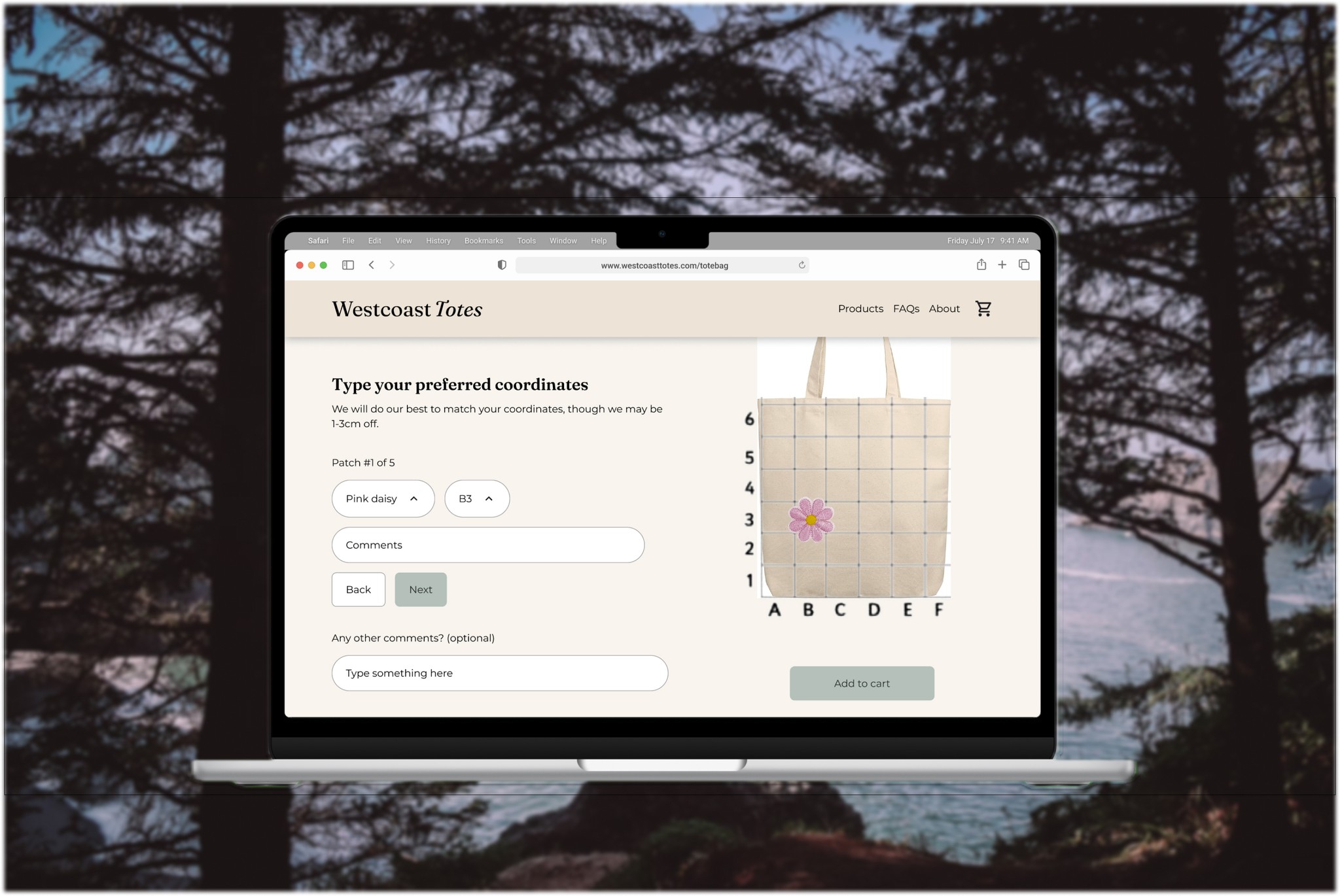
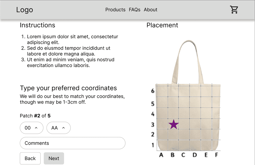
Matrix prototype:
Customers select patches then enter in the coordinates for where they want the patches placed.
Drag and drop prototype:
Customers select patches then drag them onto the tote bag to place them.
Which solution did users prefer? Which solution was most feasible?
To decide which prototype to move further with, we asked 7 users to use both prototypes and consulted with the clients and an engineer
4/7 of users preferred the drag and drop prototype
3/7 of users preferred the matrix prototype
The engineer suggested we go with the matrix prototype because the drag and drop prototype would take some more time and effort to perfect - the design process would feel clunky for users at first.
The clients wanted to maintain a high level of quality from the start and wanted their website to be up asap so we decided to go ahead with the matrix prototype.
Final designs
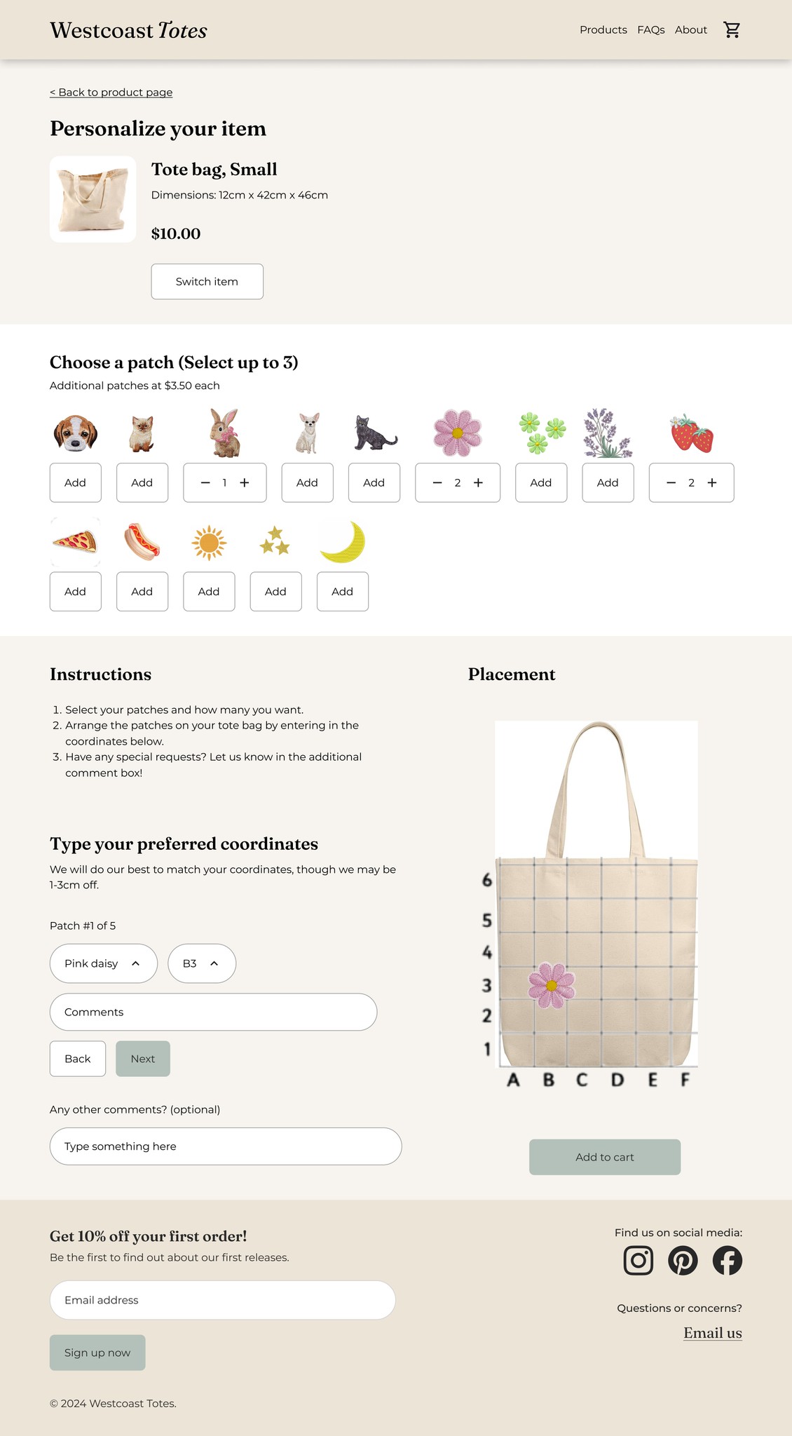
Play around with patch placement
See designs in real time
Select patches and enter in coordinates for placement
Feel free to make mistakes! Just select and delete if you don’t feel like things aren’t working
Impact
Our designs received positive feedback from users
In testing, we gathered the following quantitative feedback:
40% decrease in drop-off rate
20% increase in engagement (measured by time users spent playing with the design tool)
and the following qualitative feedback:
"Quick, simple, fun - everything you would want in online shopping"
"Everything worked really well, I would definitely recommend this to a friend"
Users' positive experiences translated into positive business impact
Online sales increased by 45% and total sales increased by 34% - meaning the website made new sales possible as opposed to cannibalizing on pop-up sales.
Reflection
Communicate issues and possible solutions early and frequently to avoid wasting time on infeasible ideas
Had I not involved the engineer early and frequently in the design process, a lot of time and resources would have been spent building wireframes and prototypes that wouldn't have been feasible within our budget/resources.
See next project:
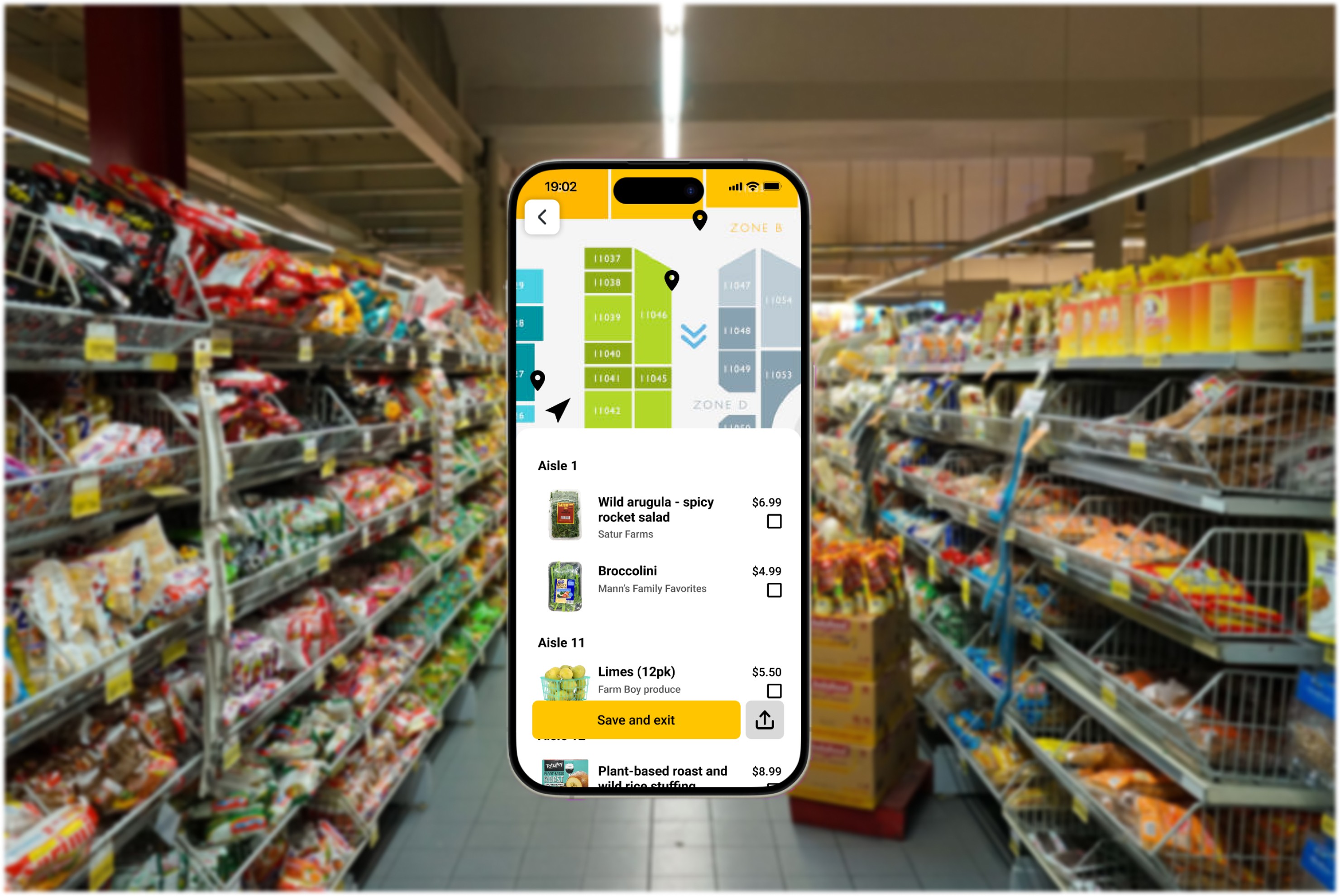
Helping users navigate grocery stores - reducing time spent grocery shopping by 30%
© 2024 portfolio by Amy Zeng
