Waldo
Waldo is a tool that helps users navigate grocery stores and streamline the entire shopping process - reducing time spent grocery shopping by 30%
Client
Personal project
Timeline
September - December 2023
My role
Lead product designer
The team
1 designer
Introduction
Waldo was a solo personal project completed over 2 months. I took ownership over all aspects of the research and design.
Problem identification
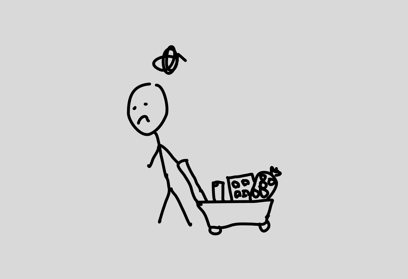
Grocery shopping is time consuming but there are opportunities to reduce time spent with proper planning
80%
of adults struggled to stay on top of household tasks
20%
of time spent on recurring tasks related to grocery shopping
40%
user estimated reduction in time spent on grocery tasks if given proper planning tools
How might we
Make grocery shopping more time-efficient?
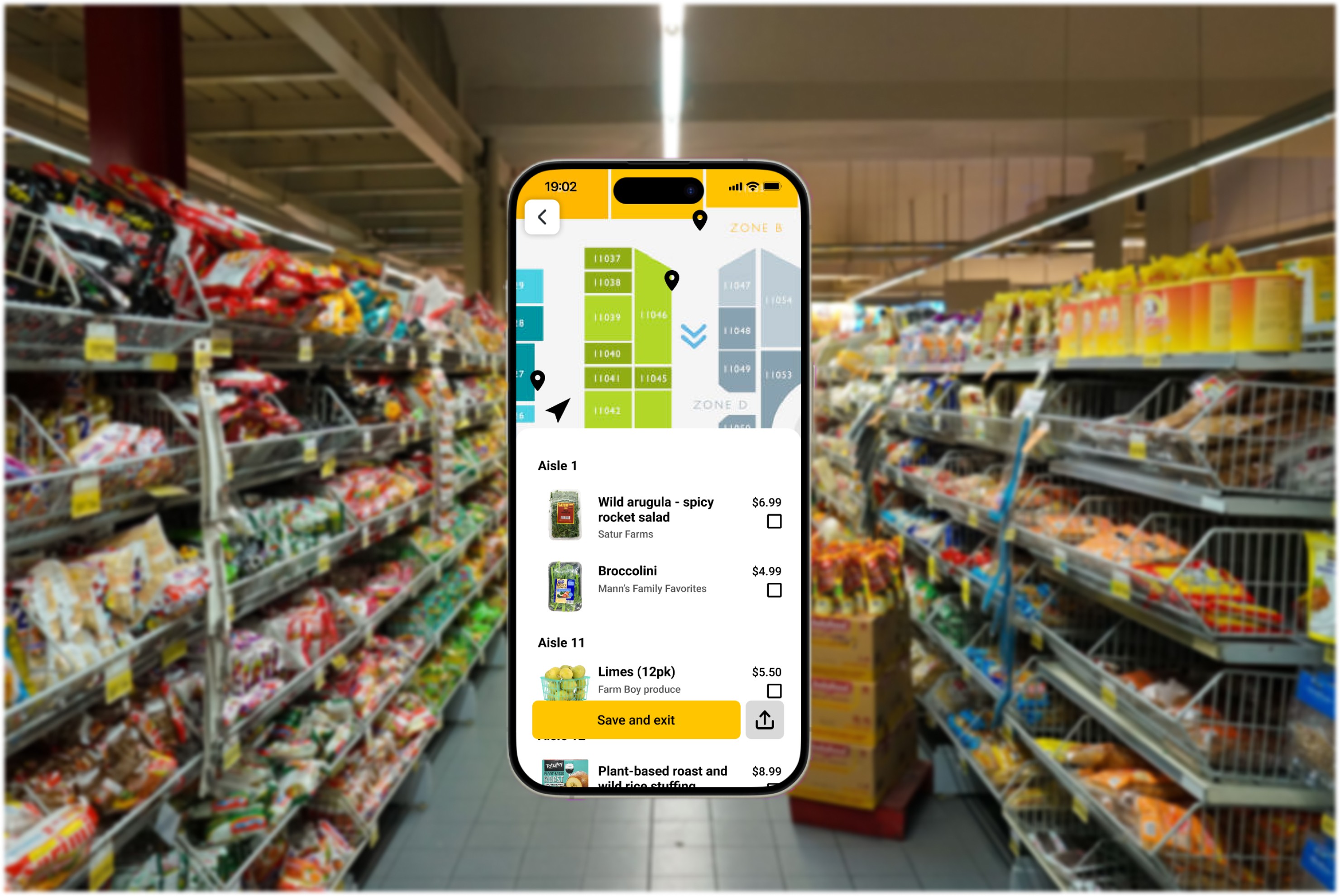
Waldo: The mobile app solution
A tool that streamlines the shopping experience
Arrive at the grocery store with a plan
Create a shopping list of things based on up-to-date stock information
Identify out of stock items ahead of time
Choose replacement items without holding up a busy store aisle
Have the time to find good replacements that fits your dietary restrictions
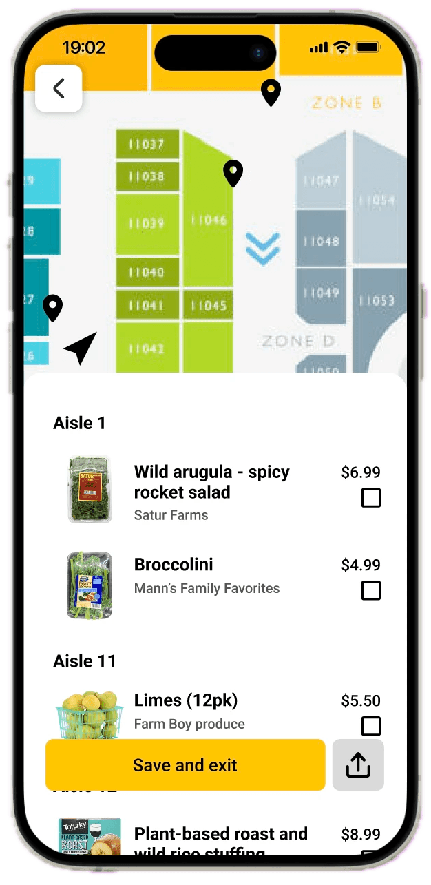
Move through the store efficiently
Follow an optimized path to complete your shopping trip
Locate all items on your list without asking for help
Follow a route optimized to keep your groceries fresh (ie. icecream will not be melting as you shop)
What do competitors offer? Where do they fall short?
Competitors fail to help users throughout the entire shopping journey, adding little value
Competitors offer only store navigation, offering users little marginal value over a store map. Based on user pain points identified in the early interviews, I hypothesized that the addition of features to help users prepare for their in-store experience would bring significant marginal value.
Mappedin
Indoor map app that takes users to sections of stores
Observations
Users would need to guess where items would be categorized in the store
No inventory information
Impact
Time consuming for users and high error rate which can be frustrating
Wasted time if items are not in-stock
Opportunities
Provide users with the location of items to reduce mental load
Provide inventory information for users to plan around
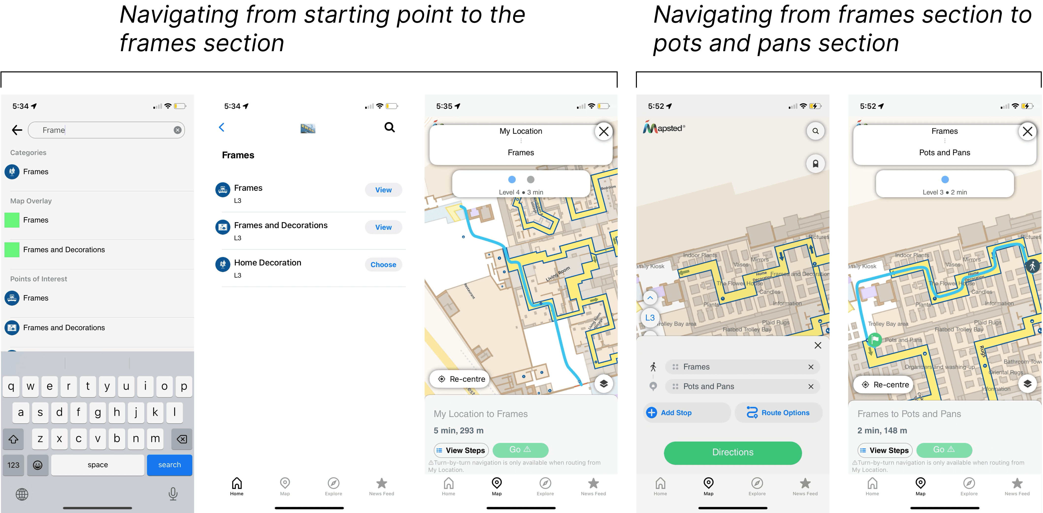
Mapsted
Indoor map app that takes users to specific products
Observations
The map will take users to each item based on the order the user entered them
Impact
Requires additional effort from the user to optimize their own route
Opportunities
Optimize the route provided to users
Research
Hypothesis
Users would find value in a tool that can guide them through the entire grocery shopping journey - from planning to execution
Do users want/need a tool to plan and navigate grocery trips?
In-context interviews with 10+ participants revealed common pain points in the shopping journey
Competitors offer only store navigation, offering users little marginal value over a store map. Based on user pain points identified in the early interviews, I hypothesized that the addition of features to help users prepare for their in-store experience would bring significant marginal value.
Key insights:
Location of items cannot be learned even by regulars
Even when a shopper is regular at a specific store, it can be difficult to track items down as stores move things around. Displays are also switched out seasonally.
Lack of route planning present significant pain points
Shoppers did not like the idea of backtracking halfway through the store lugging a heavy cart when they forgot something earlier. Especially during busy times, it can add more time than necessary to the grocery run.
Unavailable/out of stock items frustrates users and adds time to the shopping process
Shoppers were frustrated when they were unable to find an item on their list when they were in the store. It is sometimes difficult to get a hold of a staff member so they end up spending time walking the aisles looking for something that is not there.
Solution
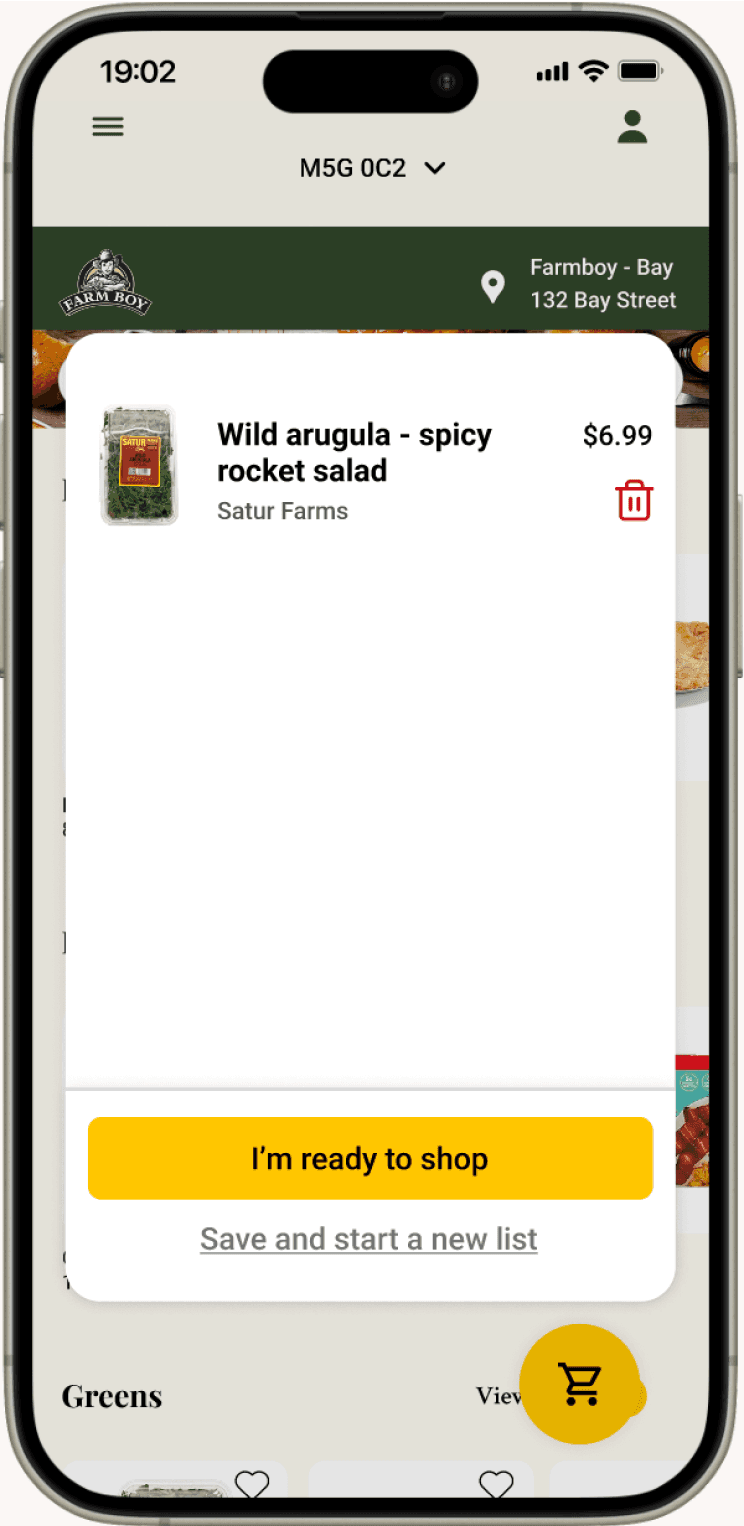
A tool that helps users create a shopping list with up-to-date stock information then finds an optimal route to collect all items.
Test, Iterate, Repeat
Iterations informed by usability studies
10+ usability studies uncovered common use-cases that required additional features in the main flow
I observed users navigating the prototype as they would use the tool and discovered certain features that needed to be more within reach and others that can be eliminated to reduce cognitive load.
Removed confusing “add new item” button
This was a secondary way to add items to the shopping list.
Users preferred the main way of adding items and were confused by this option.
Before
After
Before
After
Peace of mind when creating new lists
Users who had different lists for different stores were worried whether a list would be lost if they started a new one.
To add psychological assurance, I added a “Save Shopping List” button.
List sharing for those who don’t do their own shopping
Some users wanted the ability to send their shopping list to someone else to help them pick up the items in store.
To make that possible, I added a “Share Shopping List” button.
Before
After
Final designs
Browsing stores and creating shopping list
Picking items up in-store
Reflection
In-context interviews shed light into what features are necessary
This project pushed me to collect usability data points in different ways. I found conducting user interviews in-context was particularly helpful as it brought insights into what features were absolutely necessary and which were nice-to-haves. For example, I originally wanted users to be able to add new grocery items from the shopping screen. Observing shoppers in-context showed me that they had little need for it.
Identifying necessary vs. nice-to-have features is especially important in future projects if timelines are tight. It can allow for faster iterations which produces a product better fit for the user in a limited time frame.
Contact
Let's chat!
© 2024 portfolio by Amy Zeng.
